If you bought an iPad in April, you got a great device running a nice operating system specially designed and optimized for it. Then, in November, a new update came out for the iPad. 4.2. And all of a sudden, your iPad became a significantly more capable and better product. Multitasking, AirPlay, Game Center, and more. But one aspect of this update may be commonly taken for granted: the very low price tag of free.
This is one of the most radical features about iOS. The original iPhone was very limited when it first came out in the summer of 2007. But within a year, it got huge updates, including an App Store and location services, and within two years, got a more updates to include things like cut, copy, and paste. All for free. Now with the iPadification of Mac OS X, could we see a similar structure coming over to the desktop? Could Lion be free? And if so, what would be the implications?
One of the obvious benefits is that it will please users by giving away great features for free. They get a new and improved experience, including all the usability improvements in Lion, for no cost at all.
Another benefit is that this move would also please developers working for the platform. A developer working for the iPad can very safely assume that the vast majority of all of his/her potential customers are running iOS 4.2. Developers can bring great software taking advantage of the new capabilities the operating system offers and worry less about the people who cannot enjoy these features because they do not feel the need to upgrade. LEss hassles for developers and better software should obviously result. And with the Mac App Store just around the corner, I’m sure some of Apple’s most important priorities are attracting developers to the Mac platform and ensuring good software.
Do we have any proof of this happening? I think so.
Why is Facetime available for Snow Leopard? And why will the Mac App Store be available for Snow Leopard? Both are great features that Apple could have used to market and sell Lion. Making it available for Snow Leopard reduces the amount of great features included in Lion, therefore making it less impressive for potential customers. But if Apple is intending to distribute Lion for free, they don’t have to worry about making Lion appear more buyable. They can instead focus on promoting Facetime and the App Store before Lion is ready to roll out, and increase the user base much sooner. And the additional money that the Mac App Store is bound to bring in for Apple would, I think, more than cover the amount of money lost by not selling Lion.
Then again, this is all speculation, and I could be completely wrong.
Saturday, January 1, 2011
Friday, September 3, 2010
iTunes and its Icon/Logo
iTunes 10 was just released this Wednesday. Among its many changes was a change to the icon. At first, I was unsure and hesitant about the new icon. It seems to violate the look of the other apps in the dock, and also what is stated in the Human Interface Guidelines. It lacks that “on the desktop” look present in icons such as iCal, Preview, Mail, Safari, and even the old iTunes icon. Then I read the Viewer, Player, and Accessory Icons section in the Guidelines, particularly the following sentence:
I’ve bolded the part that particularly struck me. I realized what I think is the actual reason for the change. iTunes is no longer just software that needs an icon, as it once was. It is now an entire service that also requires a logo (this article points out the difference between icons and logos). As iTunes continues growing, it needs a quickly recognizable logo that identifies it. A simple music note placed inside a circle. The previous icon hardly did the job. It was simply too complex. And it could not be scaled up or down to a large degree, and still be recognizable.
With that, I don’t think Steve Jobs gave the complete reason for the change. iTunes didn’t have to remove the CD from its icon because it is making the CD, as a means for owning music, obsolete. If that was the case, by the same argument, Pages would have to remove the ink well from its icon, and Preview would have to remove the Paper photograph from its icon. Technology has essentially made both obsolete. However, I think there is some truth to what Jobs stated. iTunes has become so large and popular that it has overtaken the sales of CDs. The service needs an instantly recognizable, and simple symbol that people can quickly identify with the services provided by it. It is no longer just software, it is an entire ecosystem of services.
The example Apple provided in the Guidelines applies to this as well. Quicktime is quickly identified by the “Q” logo, and that can effectively serve as its icon. For example, the Quicktime icon can be simply identified with the simple black and white logo. In the same way, the new iTunes icon can quickly serve as a simple and identifiable logo for its service. I lack the skills to make a similar black and white logo for iTunes, but you can visualize what it may look like by taking out the background of the current icon. iTunes will soon be only recognized by this logo, and that is why it also serves as the new icon.
Some applications that represent objects or well known products, such as Calculator and QuickTime Player, are most easily recognized by the symbols or objects themselves.
I’ve bolded the part that particularly struck me. I realized what I think is the actual reason for the change. iTunes is no longer just software that needs an icon, as it once was. It is now an entire service that also requires a logo (this article points out the difference between icons and logos). As iTunes continues growing, it needs a quickly recognizable logo that identifies it. A simple music note placed inside a circle. The previous icon hardly did the job. It was simply too complex. And it could not be scaled up or down to a large degree, and still be recognizable.
With that, I don’t think Steve Jobs gave the complete reason for the change. iTunes didn’t have to remove the CD from its icon because it is making the CD, as a means for owning music, obsolete. If that was the case, by the same argument, Pages would have to remove the ink well from its icon, and Preview would have to remove the Paper photograph from its icon. Technology has essentially made both obsolete. However, I think there is some truth to what Jobs stated. iTunes has become so large and popular that it has overtaken the sales of CDs. The service needs an instantly recognizable, and simple symbol that people can quickly identify with the services provided by it. It is no longer just software, it is an entire ecosystem of services.
The example Apple provided in the Guidelines applies to this as well. Quicktime is quickly identified by the “Q” logo, and that can effectively serve as its icon. For example, the Quicktime icon can be simply identified with the simple black and white logo. In the same way, the new iTunes icon can quickly serve as a simple and identifiable logo for its service. I lack the skills to make a similar black and white logo for iTunes, but you can visualize what it may look like by taking out the background of the current icon. iTunes will soon be only recognized by this logo, and that is why it also serves as the new icon.
Of course, I could be completely wrong, and the people at Apple simply wanted to change iTunes’ aging icon to something completely new.
Tuesday, November 3, 2009
The Apple Store's New Checkout System
The previous checkout system employed at the retail stores consisted of handheld computers running Windows CE. But this system suffered from frequent problems. The new system, running iPhone OS 3.0 which allows use of third party accessories with the software, is much more reliable.
via AppleInsider
Monday, June 30, 2008
WALL•E
WALL•E is the new film for Pixar. I just saw this movie on Saturday, and I really believe that it is one of the best movies that Pixar has ever made. The characters are wonderful and the story is meaningful and very tightly knitted together. And after watching the movie, it just may influence you to care a bit more about the environment and Earth. But why I am I talking about WALL•E, if this is not a movie review blog but one about Apple?
As you may know, Steve Jobs had bought Pixar from Lucasfilm in 1986, very soon after he had left Apple. However, the ties with with WALL•E and Apple don't just end there. EVE, one of the robots and main characters of the movie was designed with some help from Jon Ive, the Senior Vice President of Industrial Design at Apple. The robot's seamless white design may remind you of the design of Apple products. WALL•E also watches his videos on an old iPod, magnifying the small screen multiple times to recreate a television. AUTO, the autopilot of the space station Axiom, has the voice of MacTalk, and WALL•E's truck contains an old Mac keyboard along with his other valuables. Also, you may recognize that sound WALL•E makes when he is done recharging using his solar panels!
 Enjoy WALL•E and also look for these hidden Apple related things if you watch it. And if you have a 20-inch iMac, or if you have a monitor with a resolution of 1680 x 1050, you may like the desktop picture I made. Click on the preview at left to open the full image.
WALL•E images from Pixar
Saturday, May 17, 2008
Beta Google Reader Available for iPhone
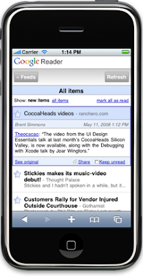
 A new version of Google Reader is available for the iPhone and iPod Touch. If you have used Google Reader before on your computer, the new version for the iPhone will be very familiar, especially if you have used list view. It allows many of the same features for Google Reader that are available on the desktop version. Since the new version is in Beta right now, when you visit Google Reader on Mobile Safari, you will not automatically be redirected to the new version. So be sure to enter in http://www.google.com/reader/i, into your browser to access it.
Read more about this new version on The Official Google Reader Blog.
Image from googlereader.blogspot.com
New Apple Ads
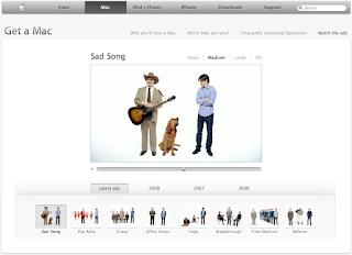
 Apple just released three new ads for TV. One of the ads, called Pep Rally, talks about the popularity of Mac computers in education. The other two, Sad Song and Group, talk about Vista's shortcomings and flaws. Even though I like the new ads, I feel that Apple is targeting Vista's flaws a little bit too much, and not focusing enough on the benefits of owning a Mac.
Along with these new ads, the Get a Mac ads website received a new look. Now the ads are grouped in sections labelled by the years that they were released in.
Image from Apple.com
Monday, May 12, 2008
New Apple Store in Boston
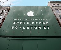
 The new Apple Store located on 815 Boylston St. in Boston, is finally opening on Thursday, May 15 at 6:00 p.m. This is a very special store. Not only is this the first store actually located in Boston, it is also one of the biggest Apple stores in the world. As a flagship store, it is boasting three levels of retail space, along with a glass facade on the front of the store. Apple says that they are giving away the usual 1000 commemorative T-Shirts as well as special prizes on the first day.. This may be like the grand opening of the W14th street Apple Store in New York, where visitors were given T-Shirts, posters, and maybe even a prize on Opening Day. So if you are in Boston Thursday evening, drop by at the Apple Store.
For more information, visit Apple's page about this store.
Image from Apple.com
iAbhimat
Subscribe to:
Comments (Atom)


